Sonal Ambani’s Handbag
Sonal Ambani’s Handbag
Sonal Ambani’s Handbag
Sonal Ambani’s Handbag
DELIVERABLES
Pitch Deck
INDUSTRY
Luxury / Art / Philanthropy
DURATION
4 weeks
PLATFORM
Print / Digital Presentation
DELIVERABLES
Pitch Deck
INDUSTRY
Luxury / Art / Philanthropy
DURATION
4 weeks
PLATFORM
Print / Digital Presentation
When a globally recognised sculptor walks in with just a story and a mission, your job isn't to design a deck. It's to build a world she can hand to a billionaire.
When a globally recognised sculptor walks in with just a story and a mission, your job isn't to design a deck. It's to build a world she can hand to a billionaire.
When a globally recognised sculptor walks in with just a story and a mission, your job isn't to design a deck. It's to build a world she can hand to a billionaire.
THE SITUATION
THE SITUATION
THE SITUATION
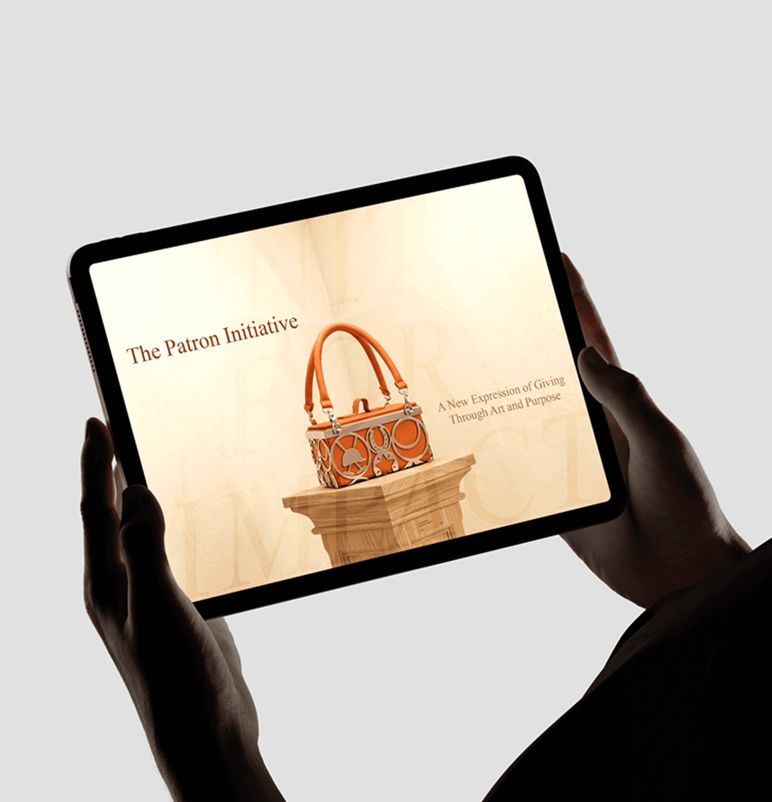
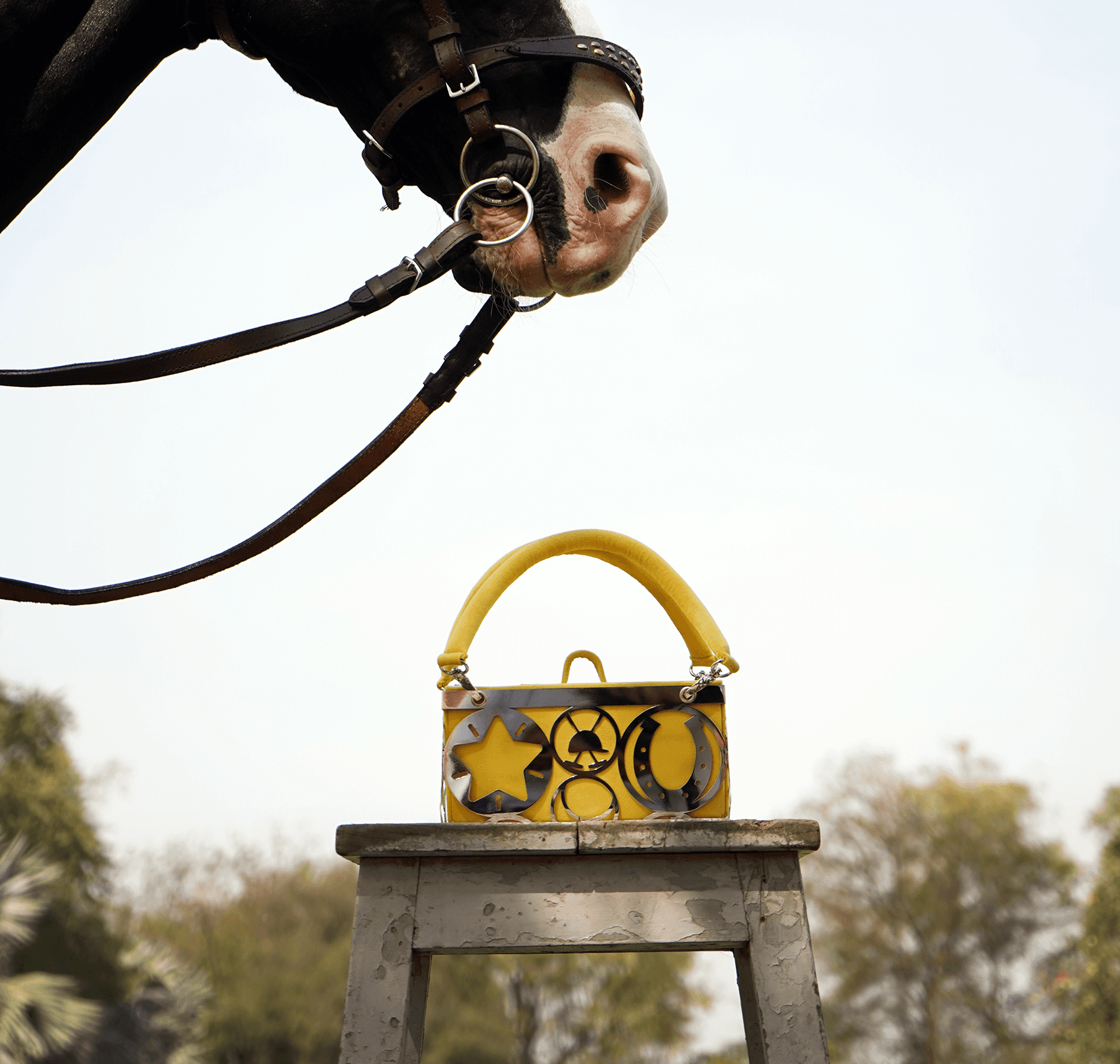
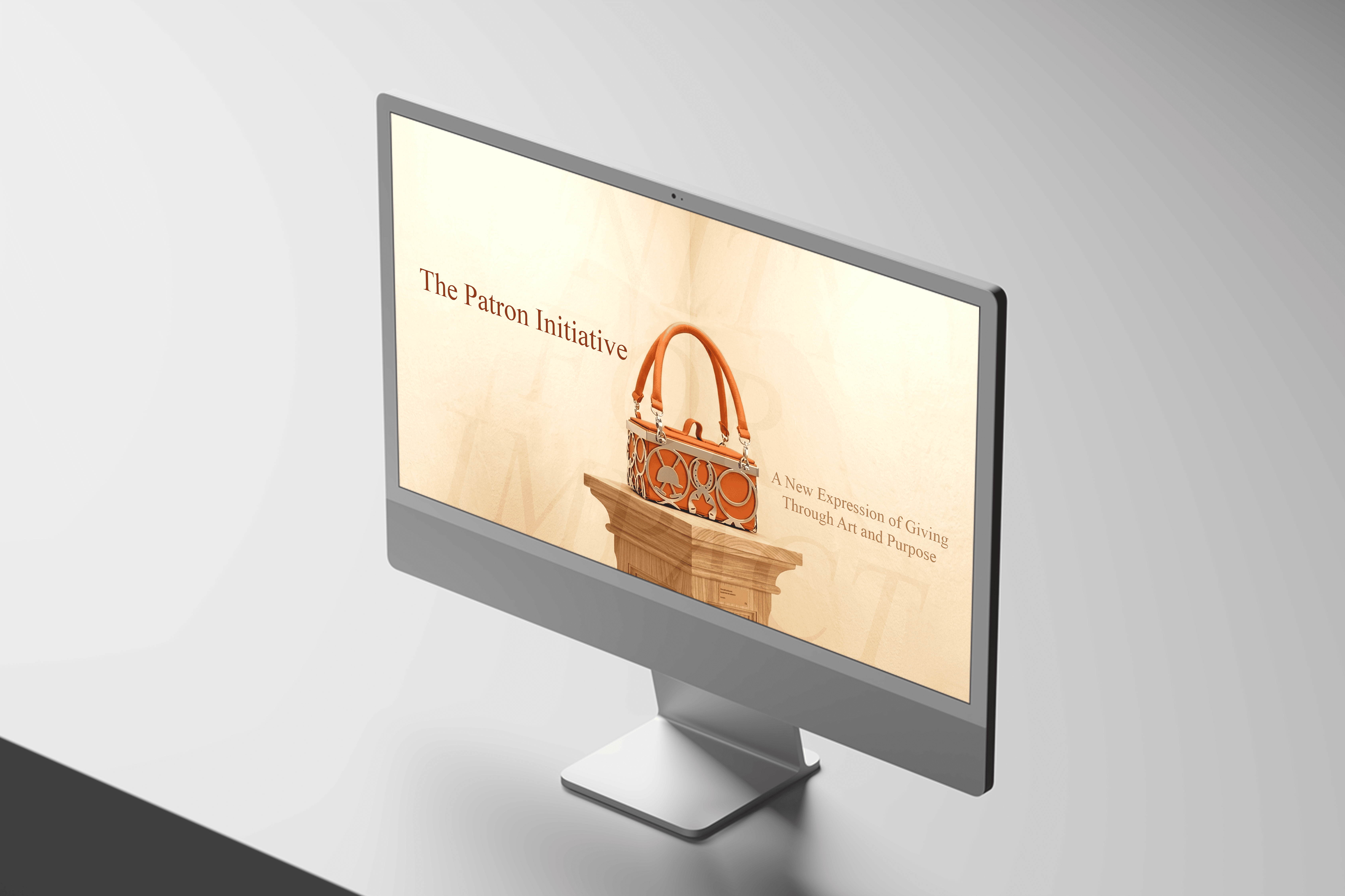
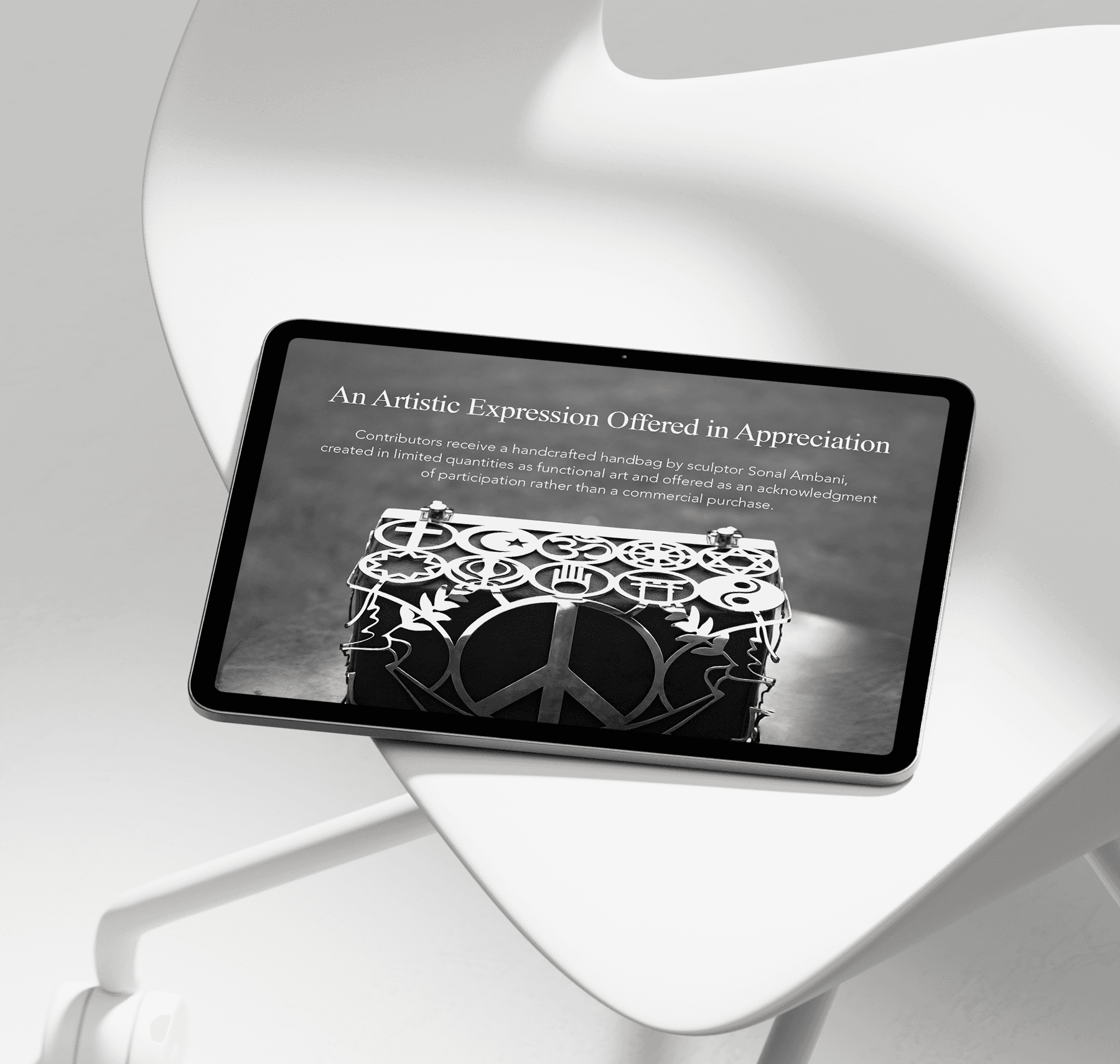
Sonal Ambani is not a startup founder. She is a globally recognised sculptor whose work commands gallery walls and private collections. Between her larger practice, she began making handbags, each one a direct translation of her sculptural forms into something you can carry. She shared them with close friends. The response was immediate.
Users often fall into “doomscrolling” endless passive consumption of content that offers little meaning or growth.
That moment of private reception turned into something larger: a mission. Sonal wanted to introduce these pieces to the world, not as products for sale, but as tokens of participation. The model was clear in her mind: donate to her cancer awareness initiative, and receive a limited handbag as a lasting acknowledgment of that contribution. A piece of wearable art. A functional sculpture. Proof that you stood for something.
Users often fall into “doomscrolling” endless passive consumption of content that offers little meaning or growth.
She came to Persist with this story, this model, and nothing else. No visual references. No written brief. No deck. Just a vision that needed to be made presentable to some of the most discerning people in the world.
Users often fall into “doomscrolling” endless passive consumption of content that offers little meaning or growth.
The typical social feed is driven by engagement metrics rather than what’s actually healthy or fulfilling.
There is a need for an alternative experience: one that encourages reflection, learning, and intention rather than distraction.
THE PROBLEM
THE PROBLEM
THE PROBLEM
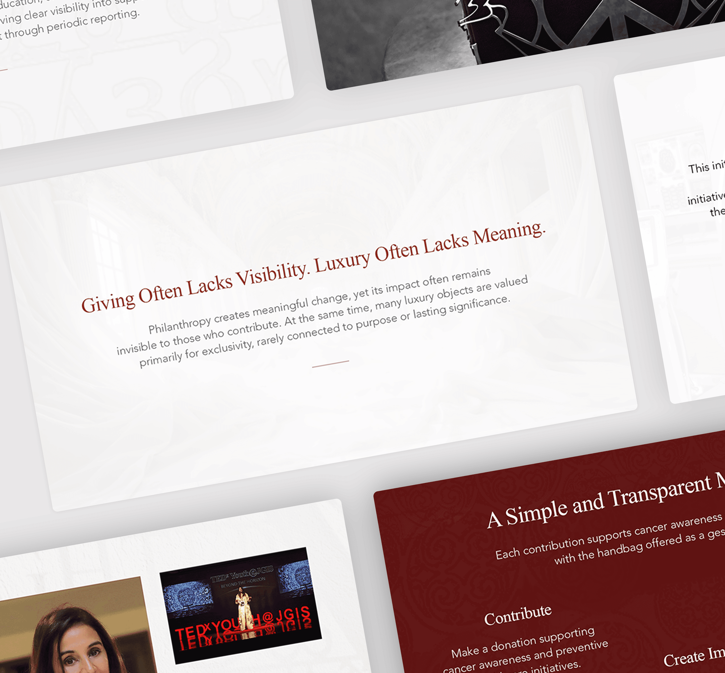
The idea was powerful. But a powerful idea, handed to the wrong room in the wrong format, disappears.
Users often fall into “doomscrolling” endless passive consumption of content that offers little meaning or growth.
Sonal's audience wasn't a general donor base. These were high net worth individuals, people who already move in the same circles as Chanel and Dior, who receive beautifully produced materials as a matter of routine, and who can spot the difference between something made with intention and something assembled quickly. For them, the presentation is the first impression of the product. If the deck felt like a charity pamphlet, the handbag would feel like one too.
Users often fall into “doomscrolling” endless passive consumption of content that offers little meaning or growth.
The tension was real and specific
The tension was real and specific
The tension was real and specific
The bag is luxury. The act is donation. Both needed to coexist without one undermining the other. There was no existing content every word, every framing decision, every narrative beat had to be created from zero. The donor needed to understand the giving model clearly, but couldn't be spoken to like a charity audience. The language had to stay elevated throughout.
This wasn't a design problem. It was a positioning and communication problem that design had to solve.
Users often fall into “doomscrolling” endless passive consumption of content that offers little meaning or growth.
The typical social feed is driven by engagement metrics rather than what’s actually healthy or fulfilling.
There is a need for an alternative experience: one that encourages reflection, learning, and intention rather than distraction.
The typical social feed is driven by engagement metrics rather than what’s actually healthy or fulfilling.
There is a need for an alternative experience: one that encourages reflection, learning, and intention rather than distraction.


THE APPROACH
THE APPROACH
THE APPROACH
We started by studying the room she was walking into.
We started by studying the room she was walking into.
We started by studying the room she was walking into.
Before a single slide was designed, we looked at how luxury operates at this level pitch materials for ultra-premium brands, private membership decks, high-end hotel magazines and catalogues. The pattern was consistent: minimal words, cinematic visuals, generous negative space, and language that suggests rather than explains. At this tier, nothing is bold. Nothing shouts. Everything is restrained, because restraint itself signals value.
That research shaped every decision that followed.
Users often fall into “doomscrolling” endless passive consumption of content that offers little meaning or growth.
The typical social feed is driven by engagement metrics rather than what’s actually healthy or fulfilling.
There is a need for an alternative experience: one that encourages reflection, learning, and intention rather than distraction.
The typical social feed is driven by engagement metrics rather than what’s actually healthy or fulfilling.
There is a need for an alternative experience: one that encourages reflection, learning, and intention rather than distraction.
We built her narrative from scratch.
We built her narrative from scratch.
We built her narrative from scratch.
Sonal didn't provide a written brief. She gave us her story, the sculptures, the handbags, the friends who first held them, the cancer initiative, the Cancer Screening & Research Trust she founded. We took that story and structured it into a deck arc: who she is, what she makes, what this initiative is, how participation works, and why it matters. Every line of body copy was written by Persist, calibrated to stay in the same tonal register throughout, elevated headlines, accessible body text. Luxury tone at the surface, clear understanding underneath.
Users often fall into “doomscrolling” endless passive consumption of content that offers little meaning or growth.
The typical social feed is driven by engagement metrics rather than what’s actually healthy or fulfilling.
There is a need for an alternative experience: one that encourages reflection, learning, and intention rather than distraction.
Her sculptures became the design language.
Her sculptures became the design language.
Her sculptures became the design language.
The visual direction was anchored in the red of her existing website, already minimal, already refined. But we went further. The geometric forms from Sonal's own sculptural works were extracted and used as recurring design elements across the deck. The art wasn't just referenced, it was structurally present in the layout. The deck itself became a visual extension of her practice.
Users often fall into “doomscrolling” endless passive consumption of content that offers little meaning or growth.
The typical social feed is driven by engagement metrics rather than what’s actually healthy or fulfilling.
There is a need for an alternative experience: one that encourages reflection, learning, and intention rather than distraction.
The hardest section to get right: the donation mechanism.
The hardest section to get right: the donation mechanism.
The hardest section to get right: the donation mechanism.
This is where we went through the most iterations, four rounds in total. The question we kept returning to was: how much do you explain the giving model before the luxury framing cracks?
Users often fall into “doomscrolling” endless passive consumption of content that offers little meaning or growth.
Our first version leaned entirely into high-end visual language. It looked impeccable. But the donation pathway was unclear. We had overcorrected, the deck felt more like a luxury brand lookbook than a philanthropic proposition.
Users often fall into “doomscrolling” endless passive consumption of content that offers little meaning or growth.
We pulled back. We gave the donation model more space, more specificity. But then the visual register shifted too far toward charity. We toned the luxury back up.
Users often fall into “doomscrolling” endless passive consumption of content that offers little meaning or growth.
We found the answer in structure: keep every headline in luxury register, let the body copy carry the practical clarity. The reader's eye lands on something beautiful. Their mind receives something they can act on. The two layers work together without collision.
Users often fall into “doomscrolling” endless passive consumption of content that offers little meaning or growth.
The final deck provides a direct link to participate in the initiative, the CTA is embedded, not appended as an afterthought.
Users often fall into “doomscrolling” endless passive consumption of content that offers little meaning or growth.
The typical social feed is driven by engagement metrics rather than what’s actually healthy or fulfilling.
There is a need for an alternative experience: one that encourages reflection, learning, and intention rather than distraction.
THE OUTCOME
THE OUTCOME
The deck Sonal now holds is not a presentation about her handbag. It is a statement of artistic identity, philanthropic architecture, and visual restraint. built to be read in the same rooms where Chanel catalogues sit on coffee tables.
Users often fall into “doomscrolling” endless passive consumption of content that offers little meaning or growth.
Built entirely from story. No brief. No references. No existing materials.
It positions her initiative alongside the houses that define global luxury, while making clear that her model carries something they do not: purpose that participates.
Users often fall into “doomscrolling” endless passive consumption of content that offers little meaning or growth.
Sonal was drawn to how the final design felt personal. her sculptures weren't just referenced in the content but were woven into the geometry of the layout itself. The deck is now in the hands of her and her marketing team, ready to be shared with the people she is building this for.
Users often fall into “doomscrolling” endless passive consumption of content that offers little meaning or growth.
The typical social feed is driven by engagement metrics rather than what’s actually healthy or fulfilling.
There is a need for an alternative experience: one that encourages reflection, learning, and intention rather than distraction.
The typical social feed is driven by engagement metrics rather than what’s actually healthy or fulfilling.
There is a need for an alternative experience: one that encourages reflection, learning, and intention rather than distraction.
Other Projects
Other Projects

Ready
to take
the next
s
t
p
?
No pitch. No fluff. Just a straight conversation about your product and whether we're the right fit. Most founders know in the first 15 minutes.
Ready
to take
the next
s
t
p
?
No pitch. No fluff. Just a straight conversation about your product and whether we're the right fit. Most founders know in the first 15 minutes.
Ready
to take
the next
s
t
p
?
No pitch. No fluff. Just a straight conversation about your product and whether we're the right fit. Most founders know in the first 15 minutes.