Vyspar
Vyspar
Vyspar
Vyspar
DELIVERABLES
UX/UI Design
INDUSTRY
Healthcare
DURATION
Ongoing
PLATFORM
Web
DELIVERABLES
UX/UI Design
INDUSTRY
Healthcare
DURATION
Ongoing
PLATFORM
Web

A doctor switching between seven tabs to answer one clinical question built the platform that makes that never happen again. We built it with her.
A doctor switching between seven tabs to answer one clinical question built the platform that makes that never happen again. We built it with her.
A doctor switching between seven tabs to answer one clinical question built the platform that makes that never happen again. We built it with her.
THE SITUATION
THE SITUATION
THE SITUATION
Dr. Amanda Sheaffer is a practising physician. She knows what it feels like to be mid-consultation, needing a reliable answer to a clinical question, and having nowhere fast to find one.
Users often fall into “doomscrolling” endless passive consumption of content that offers little meaning or growth.
The reality of clinical practice is that the knowledge a doctor needs is scattered everywhere, PDF guidelines, research papers, institutional portals, colleagues down the corridor, informal message groups, memory. Each source requires a different effort to access. Each one carries a different level of trust. And none of them talk to each other.
Users often fall into “doomscrolling” endless passive consumption of content that offers little meaning or growth.
Dr. Sheaffer experienced this friction directly, repeatedly. The process of finding reliable, updated clinical information during patient care was slow, fragmented, and confidence-draining, exactly when confidence matters most. She didn't just observe the problem as a gap in the market. She felt it as a professional, every day.
Users often fall into “doomscrolling” endless passive consumption of content that offers little meaning or growth.
That experience became Vyspar.
Users often fall into “doomscrolling” endless passive consumption of content that offers little meaning or growth.
When she came to Persist, she had an early-stage dummy web application that outlined the rough shape of the vision, covering only a fraction of what the product needed to be, with limited structure and no design depth. She had a direction. She needed a team who could take that direction all the way to a platform worthy of the idea behind it.
Users often fall into “doomscrolling” endless passive consumption of content that offers little meaning or growth.
The typical social feed is driven by engagement metrics rather than what’s actually healthy or fulfilling.
There is a need for an alternative experience: one that encourages reflection, learning, and intention rather than distraction.
THE PROBLEM
THE PROBLEM
THE PROBLEM
Healthcare runs on knowledge. But the systems that carry that knowledge were not built for how healthcare actually works.
Users often fall into “doomscrolling” endless passive consumption of content that offers little meaning or growth.
Clinical professionals today navigate a landscape of fragmented, disconnected sources, research papers behind paywalls, PDF guidelines that may or may not be the latest version, institutional portals that differ from hospital to hospital, and informal peer communication through channels that were never designed for clinical rigour.
Users often fall into “doomscrolling” endless passive consumption of content that offers little meaning or growth.
The consequences are real and specific:
The consequences are real and specific:
The consequences are real and specific:
→ Information that should take seconds to access takes minutes, or doesn't get accessed at all
→ There is no reliable way to validate a clinical decision against trusted, current knowledge in real time
→ AI tools available to professionals are trained on general data, not verified medical knowledge — making their answers plausible but not trustworthy
→ Peer engagement and knowledge exchange happen in environments (email, WhatsApp, general social platforms) that were built for everything except this
The gap wasn't just inconvenience. It was a structural absence,no single environment where verified clinical knowledge, peer engagement, and intelligent decision support existed together, built specifically for the people who need it. Vyspar was built to close that gap.
Users often fall into “doomscrolling” endless passive consumption of content that offers little meaning or growth.
The typical social feed is driven by engagement metrics rather than what’s actually healthy or fulfilling.
There is a need for an alternative experience: one that encourages reflection, learning, and intention rather than distraction.
The typical social feed is driven by engagement metrics rather than what’s actually healthy or fulfilling.
There is a need for an alternative experience: one that encourages reflection, learning, and intention rather than distraction.


THE APPROACH
THE APPROACH
THE APPROACH
Starting from an early sketch, building to a full platform.
Starting from an early sketch, building to a full platform.
Starting from an early sketch, building to a full platform.
Vyspar arrived as an idea with a rough prototype attached, enough to communicate intent, not enough to communicate the product. Our first task was to understand what the platform actually needed to be before designing a single screen. One year of sprint-based development later, that early sketch has become a complete platform with its own design system, a full component library, and a product ready to support investors, healthcare institutions, and the professionals it was built for.
Users often fall into “doomscrolling” endless passive consumption of content that offers little meaning or growth.
The typical social feed is driven by engagement metrics rather than what’s actually healthy or fulfilling.
There is a need for an alternative experience: one that encourages reflection, learning, and intention rather than distraction.
The typical social feed is driven by engagement metrics rather than what’s actually healthy or fulfilling.
There is a need for an alternative experience: one that encourages reflection, learning, and intention rather than distraction.
Designing for the highest-stakes users in any industry.
Designing for the highest-stakes users in any industry.
Designing for the highest-stakes users in any industry.
Healthcare UX is not like designing for a SaaS dashboard or a consumer app. The users are time-poor by default. The information is dense and non-negotiable in its accuracy. The cost of confusion, a missed detail, an unclear hierarchy, a buried feature, is measured differently here than in most products.
Users often fall into “doomscrolling” endless passive consumption of content that offers little meaning or growth.
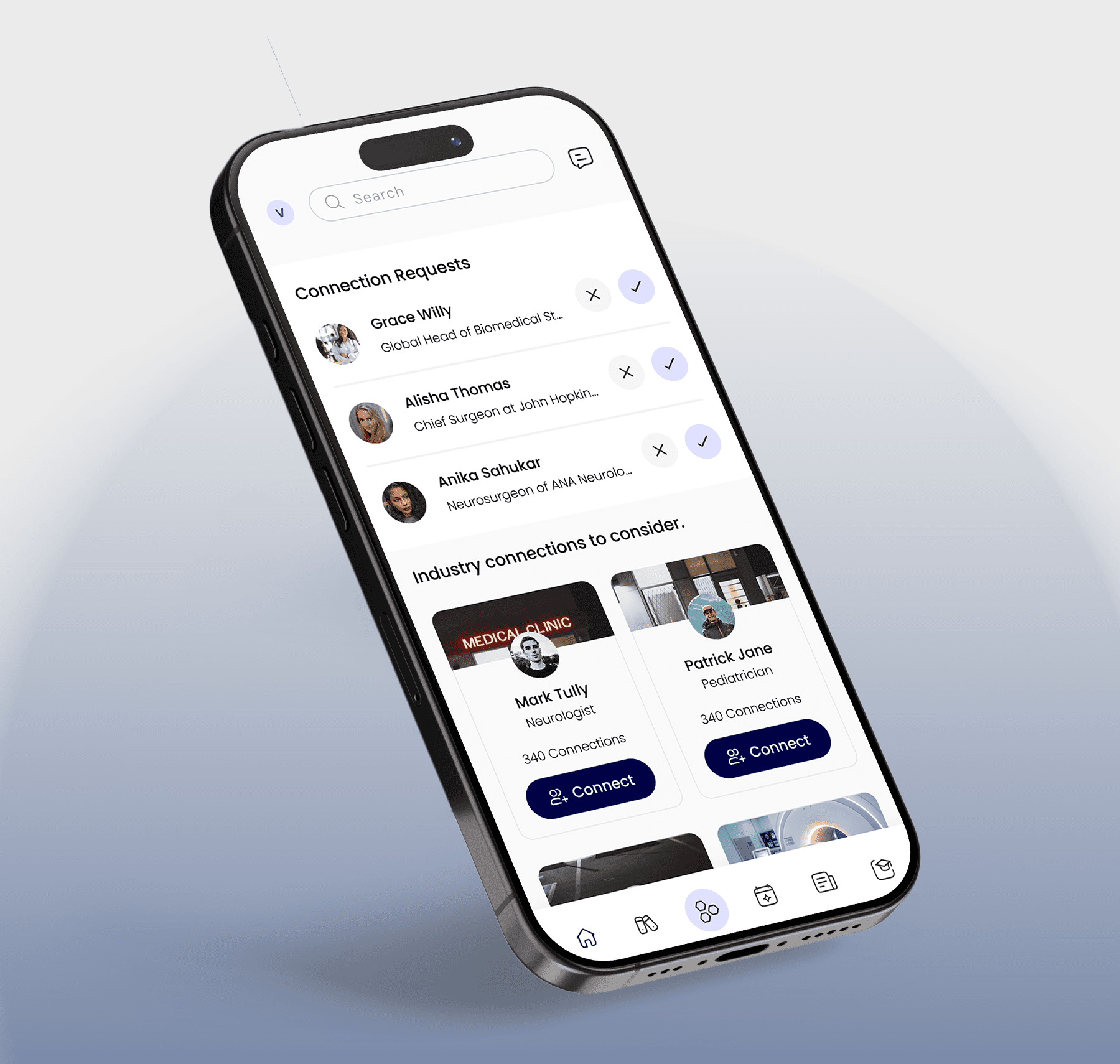
Every design decision on Vyspar was filtered through a single question: can a doctor find what they need in the time they have? That meant reducing cognitive load at every layer. Clear information hierarchy. Structured layouts that guide the eye without demanding it. Navigation that doesn't require learning, just knowing. Complex clinical data made instantly scannable so professionals can move fast without moving wrong.
Users often fall into “doomscrolling” endless passive consumption of content that offers little meaning or growth.
The typical social feed is driven by engagement metrics rather than what’s actually healthy or fulfilling.
There is a need for an alternative experience: one that encourages reflection, learning, and intention rather than distraction.
The Collectives model, and why the AI had to stay inside the lines.
The Collectives model, and why the AI had to stay inside the lines.
The Collectives model, and why the AI had to stay inside the lines.
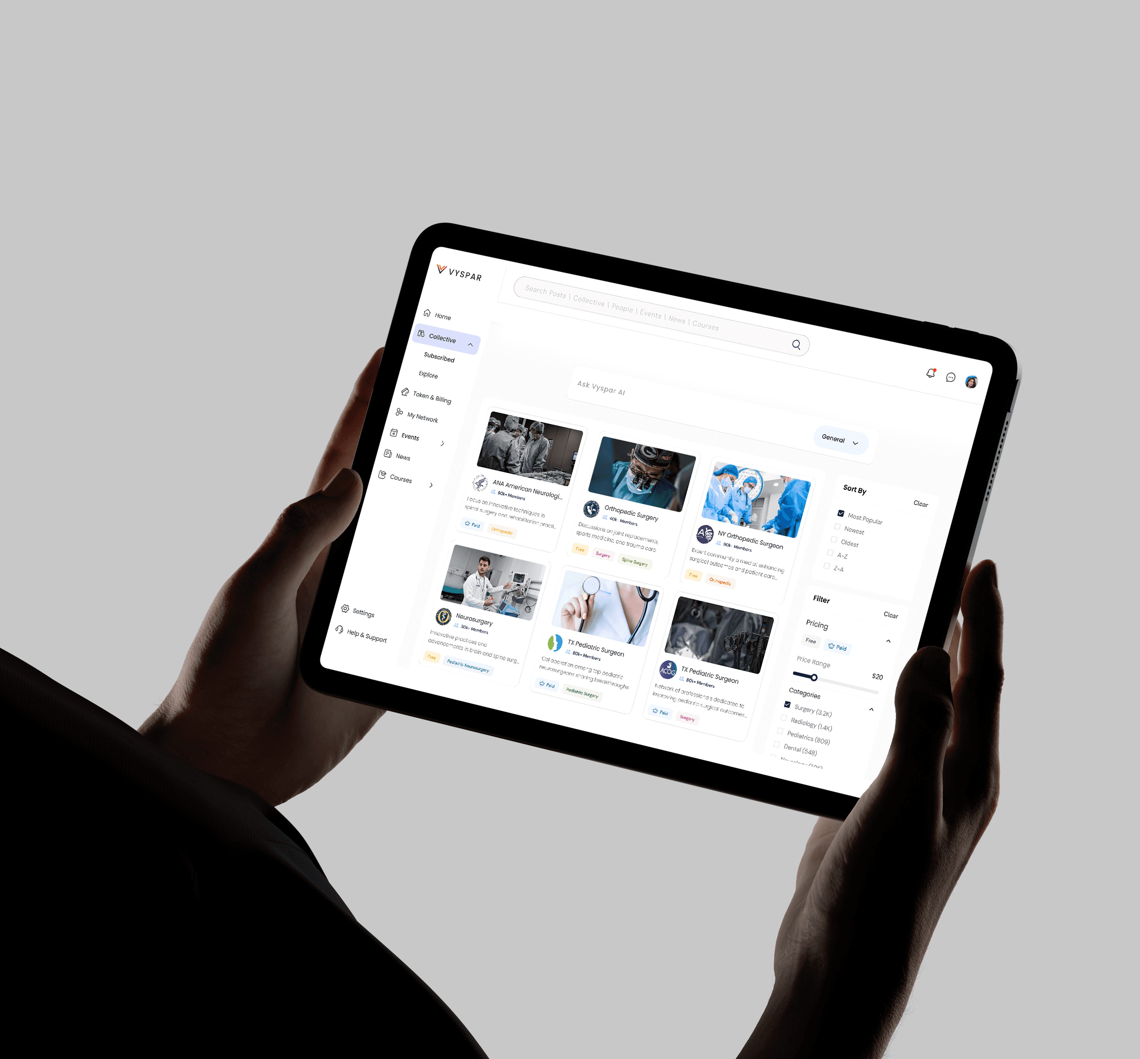
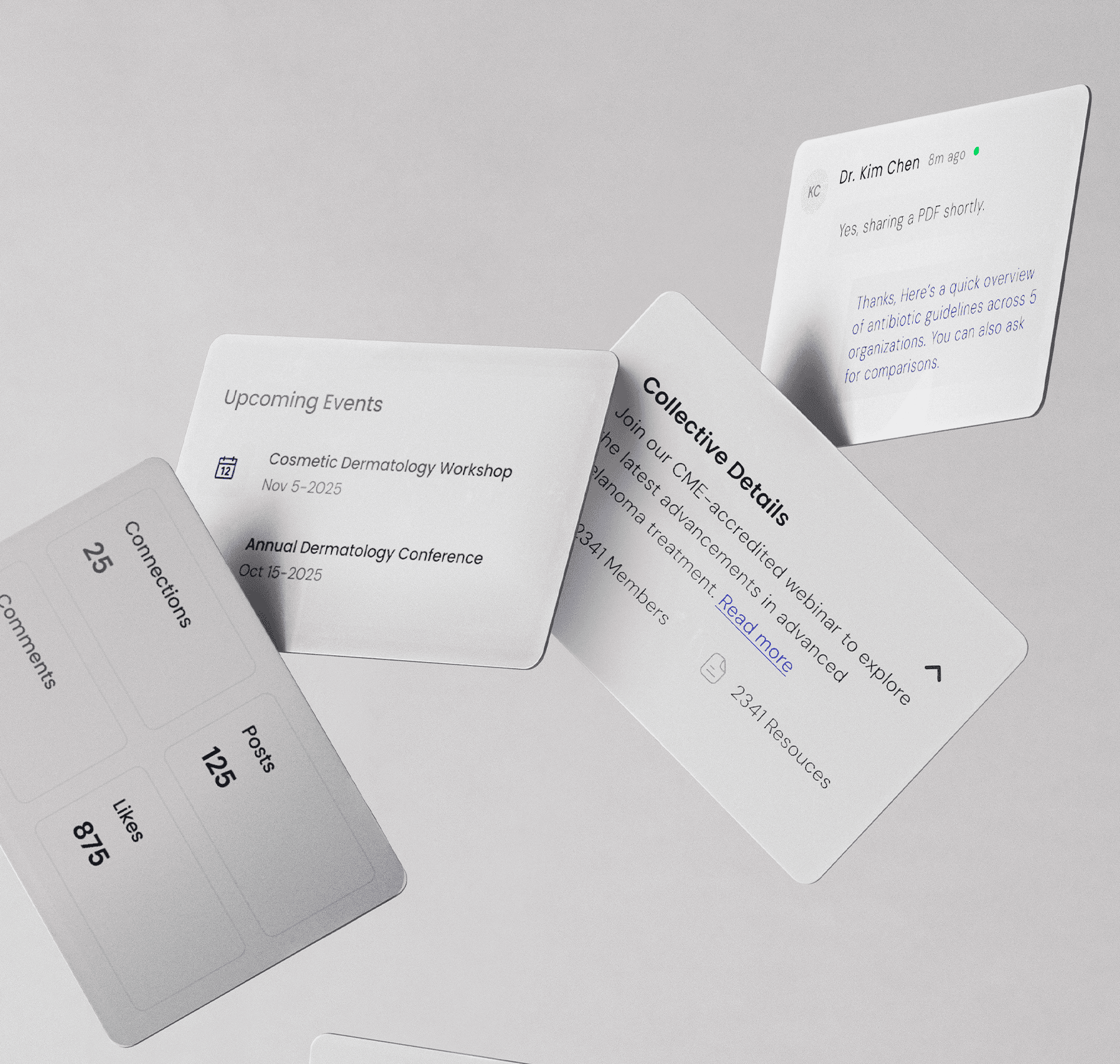
The core of Vyspar is the Collective: a structured, verified set of clinical resources curated by trusted organisations and experts. Professionals explore Collectives relevant to their field, and when they interact with the platform's AI, it responds exclusively within that Collective's verified knowledge base.
Users often fall into “doomscrolling” endless passive consumption of content that offers little meaning or growth.
This constraint was not a limitation, it was the entire point. General AI gives plausible answers. Vyspar's AI gives verified ones. Designing the interface to make that distinction clear, credible, and reassuring to a clinical audience was one of the central design challenges. The AI needed to feel capable and intelligent, while the user always understood exactly what it knew and why they could trust it.
Users often fall into “doomscrolling” endless passive consumption of content that offers little meaning or growth.
The typical social feed is driven by engagement metrics rather than what’s actually healthy or fulfilling.
There is a need for an alternative experience: one that encourages reflection, learning, and intention rather than distraction.
The hardest decision: what not to show.
The hardest decision: what not to show.
The hardest decision: what not to show.
The biggest design challenge on Vyspar wasn't adding features, it was resisting the impulse to add them. A platform serving hospitals, medical associations, universities, MedTech organisations, and state health departments carries enormous potential scope. Every stakeholder group has its own workflow, its own data needs, its own expectations.
Users often fall into “doomscrolling” endless passive consumption of content that offers little meaning or growth.
The temptation was to reflect all of that on screen. We did the opposite. Excessive dashboards, secondary filters, notification layers, and visual complexity were consciously stripped out. The interface was built around one primary experience: access verified knowledge, interact with it intelligently, and engage with peers in the same environment. Every feature that didn't serve that experience directly was left out of the current scope.
Users often fall into “doomscrolling” endless passive consumption of content that offers little meaning or growth.
That restraint is what keeps Vyspar feeling focused and trustworthy rather than overwhelming.
Users often fall into “doomscrolling” endless passive consumption of content that offers little meaning or growth.
The typical social feed is driven by engagement metrics rather than what’s actually healthy or fulfilling.
There is a need for an alternative experience: one that encourages reflection, learning, and intention rather than distraction.
A design system built to scale with the platform.
A design system built to scale with the platform.
A design system built to scale with the platform.
Before a single high-fidelity screen was designed, we established the complete design system, colour palette, typography, spacing, iconography, interaction patterns. From that foundation, a full component library followed: buttons, cards, input fields, layouts, and every reusable element the platform would need. This wasn't housekeeping, it was infrastructure. A platform serving multiple healthcare stakeholder types, expanding across sprints aligned to investor milestones, cannot be built consistently without a shared system underneath it.
Users often fall into “doomscrolling” endless passive consumption of content that offers little meaning or growth.
The typical social feed is driven by engagement metrics rather than what’s actually healthy or fulfilling.
There is a need for an alternative experience: one that encourages reflection, learning, and intention rather than distraction.
Sprint cadence aligned to investor milestones.
Sprint cadence aligned to investor milestones.
Sprint cadence aligned to investor milestones.
The project was structured in sprints, each timed to support an investor demo or a major presentation. This meant every phase of design had a real deadline with a real audience, not internal review, but external presentation to the people whose confidence in Vyspar would determine its next stage. That discipline sharpened every decision and ensured the platform was always presentation-ready, not just development-ready.
Users often fall into “doomscrolling” endless passive consumption of content that offers little meaning or growth.
Promotional videos were also produced alongside the product design to support investor communication, giving Dr. Sheaffer a complete set of materials to take into every room she walked into.
Users often fall into “doomscrolling” endless passive consumption of content that offers little meaning or growth.
The typical social feed is driven by engagement metrics rather than what’s actually healthy or fulfilling.
There is a need for an alternative experience: one that encourages reflection, learning, and intention rather than distraction.
THE DESIGN
THE DESIGN
One year in, Vyspar is a complete platform, not a prototype, not an MVP wireframe, but a functioning product with verified clinical knowledge infrastructure, AI-restricted to trusted data, peer engagement tools, Pulse Intelligence for real-time health domain insights, and built-in analytics for both Collective creators and individual users.
Users often fall into “doomscrolling” endless passive consumption of content that offers little meaning or growth.
Those analytics matter. Organisations using Vyspar can track user engagement, feature usage, and activity across their Collectives. Individual professionals can track token usage, content reach, and interaction on their posts. The platform is not just a place to access knowledge, it is a system that gets smarter about how knowledge is used.
Users often fall into “doomscrolling” endless passive consumption of content that offers little meaning or growth.
Dr. Sheaffer described what makes Vyspar distinctly valuable: the ability to search and interact with curated, verified clinical knowledge and simultaneously engage in peer discussion, within the same environment, without switching tabs, without questioning the source. That is what Vyspar does that nothing else does.
Users often fall into “doomscrolling” endless passive consumption of content that offers little meaning or growth.
The platform continues to evolve. The engagement continues. And the idea that started as a doctor's daily frustration is now a platform ready to change how medicine shares what it knows.
Users often fall into “doomscrolling” endless passive consumption of content that offers little meaning or growth.
The typical social feed is driven by engagement metrics rather than what’s actually healthy or fulfilling.
There is a need for an alternative experience: one that encourages reflection, learning, and intention rather than distraction.
The typical social feed is driven by engagement metrics rather than what’s actually healthy or fulfilling.
There is a need for an alternative experience: one that encourages reflection, learning, and intention rather than distraction.
Other Projects
Other Projects


Ready
to take
the next
s
t
p
?
No pitch. No fluff. Just a straight conversation about your product and whether we're the right fit. Most founders know in the first 15 minutes.
Ready
to take
the next
s
t
p
?
No pitch. No fluff. Just a straight conversation about your product and whether we're the right fit. Most founders know in the first 15 minutes.
Ready
to take
the next
s
t
p
?
No pitch. No fluff. Just a straight conversation about your product and whether we're the right fit. Most founders know in the first 15 minutes.